Brand Guidelines | Chicago Bears Official Website


The bear head is the primary visual identifier of the Chicago Bears. The mark includes a white outline which helps ensure the definition of the mark on dark backgrounds. CMYK, RGB, Pantone, one-color, and grayscale variations are available.
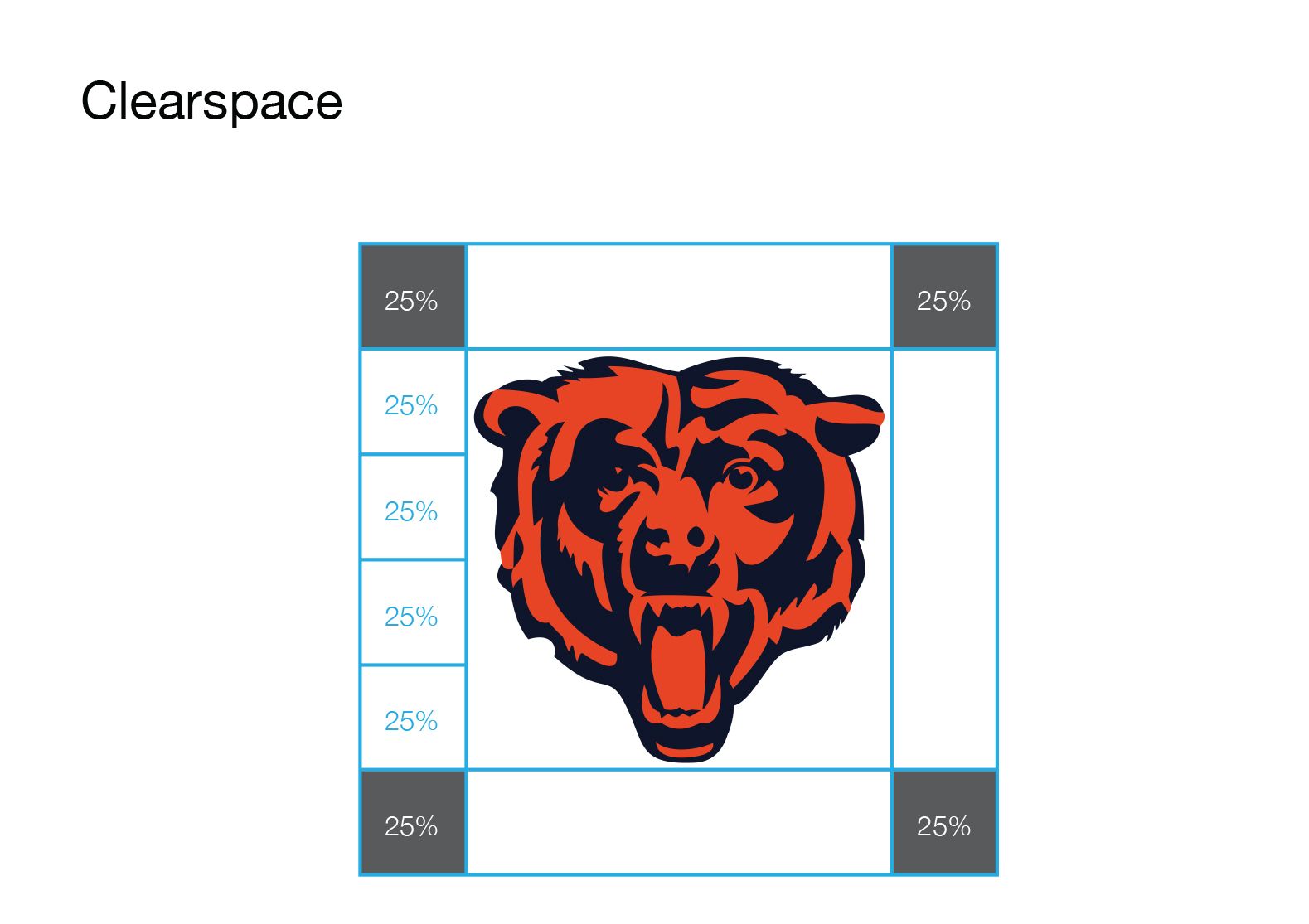
The Bear Head should be surrounded by a field of clearspace to isolate it from competing graphic elements and ensure its visibility and impact. The clearspace minimum is equal to 25% of the height of the Bear Head. Please note that clearspace is not the same as whitespace.
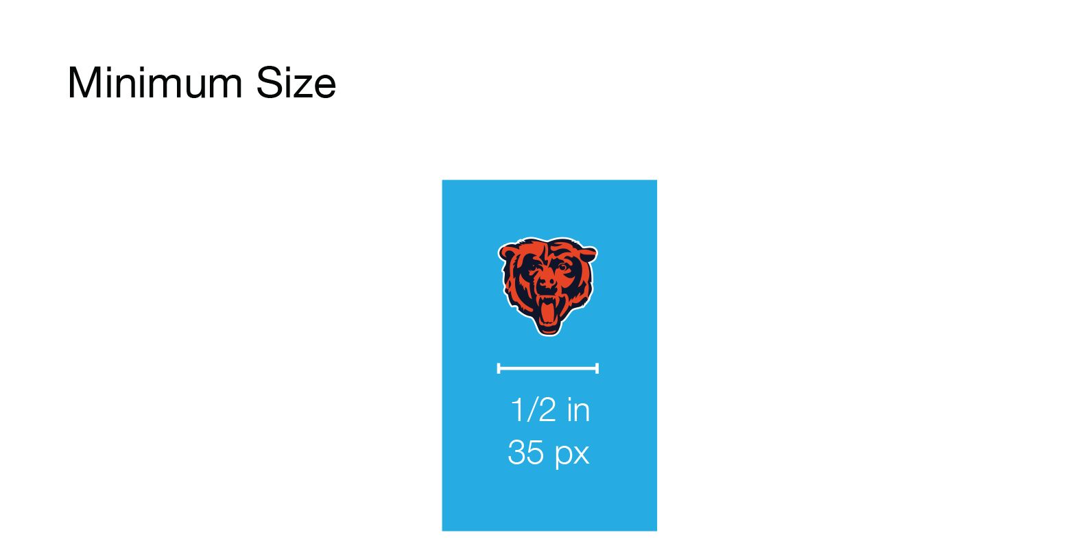
The Bear Head can appear in a variety of sizes to accommodate a range of applications, but it should not be sized so small that it becomes illegible. It should not be reproduced such that the width of the Bear Head is less than 1/2 inch or 35 pixels digitally.
The C is preferred for projects featuring embroidery. The C is the only mark that should be utilized in print applications requiring the width of the mark to be reproduced smaller than 1/2 inch and digital applications requiring the width of the mark to be reproduced smaller than 35 pixels. Use good judgment to ensure legibility.

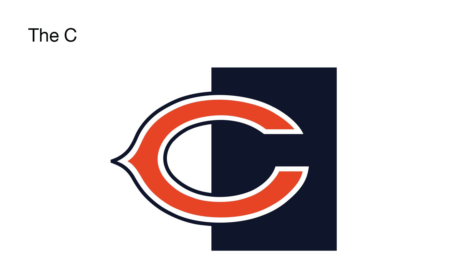
The C is the secondary mark of the Chicago Bears and is designed to compliment the primary mark. Use of the secondary mark is necessary when the primary mark's minimum size requirements can't be met. CMYK, RGB, Pantone, one-color, and grayscale variations are available.
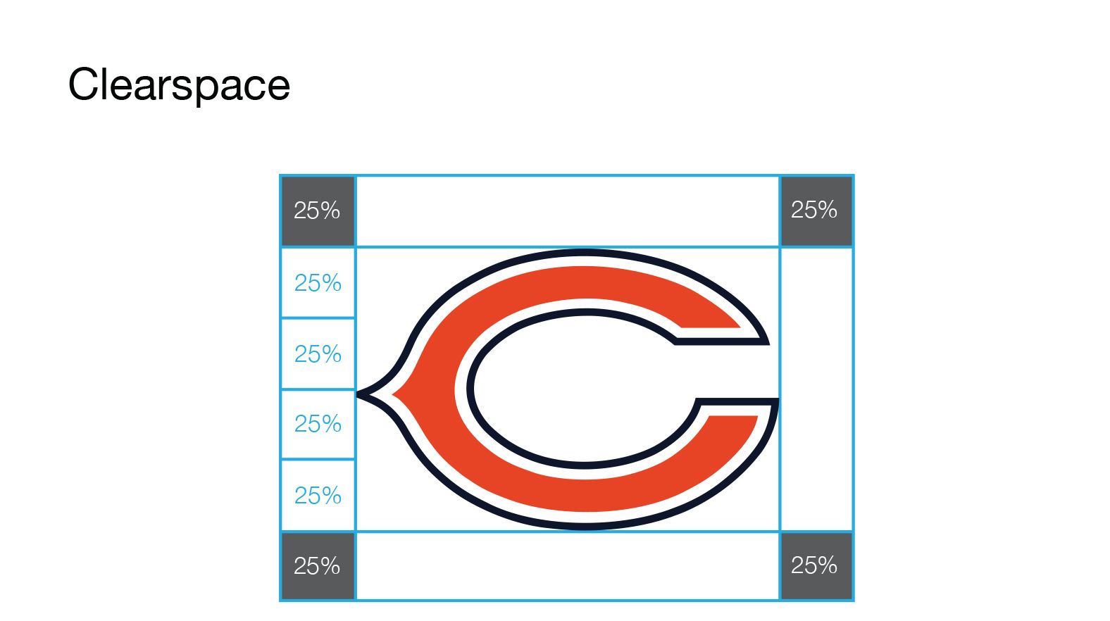
The C should be surrounded by a field of clearspace to isolate it from competing graphic elements and ensure its visibility and impact. The clearspace minimum is equal to 25% of the height of the C. Please note that clearspace is not the same as whitespace.
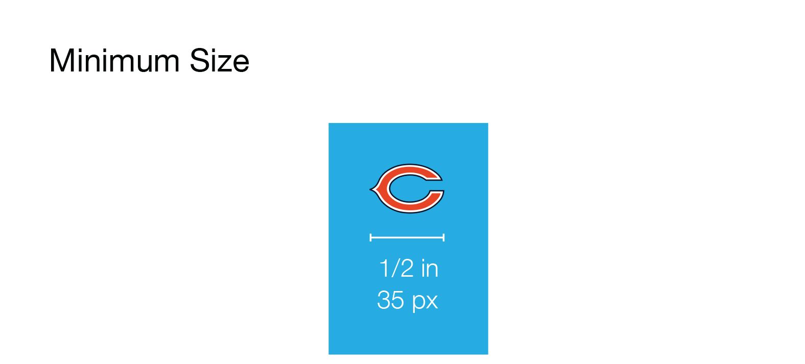
The C can appear in a variety of sizes to accommodate a range of applications, but it should not be sized so small that it becomes illegible. It is preferred that the width of the C is never less than 1/2 inch or 35 pixels digitally. If a Bears mark is required to be reproduced smaller than 1/2 inch or 35 pixels digitally, the C is the only mark that should be utilized.
The C is preferred for projects featuring embroidery.

Bears is the logotype of the Chicago Bears and is designed to compliment the primary mark and secondary mark. CMYK, RGB, Pantone, one-color, and grayscale variations are available
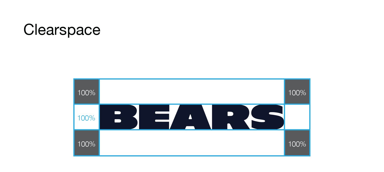
Bears should be surrounded by a field of clearspace to isolate it from competing graphic elements and ensure its visibility and impact. The clearspace minimum is equal to 100% of the height of the letters in Bears. Please note that clearspace is not the same as whitespace.
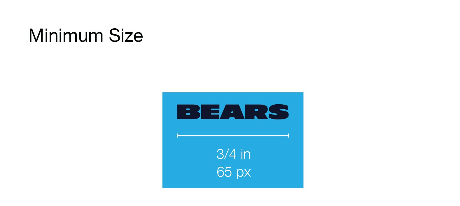
Bears can appear in a variety of sizes to accommodate a range of applications, but it should not be sized so small that it becomes illegible. It should not be reproduced such that the width of Bears is less than 3/4 inch or 65 pixels digitally.
The C is preferred for projects featuring embroidery. The C is the only mark that should be utilized in print applications requiring the width of the mark to be reproduced smaller than 1/2 inch and digital applications requiring the width of the mark to be reproduced smaller than 35 pixels. Use good judgment to ensure legibility.